Heh, I was just teasing. Cartoony isn't a word that comes to my mind - the style is mimicking stained glass which one doesn't associate with "cartoony" - but I can see that, I guess. . Though I can't help but be amused that when I said:
I can see the appeal of Blok but I find the way he draws people kinda silly looking, almost like kid's-book cartoons.
PtB said:
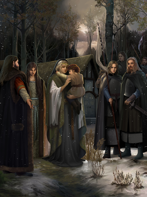
I like his broader landscapes best (such as Amon Hen and the Hornburg) but appreciate his figures as reflecting a lighter take on old medieval forms. They're a bit like the figures on the Bayeux tapestry, but infused with a child's sense of wonder...Like Tolkien, I don't really believe in the child-adult distinction when it comes to art and literature...
No, it's this Guo's fella who's infused with a child's sense of wonder, and Blok who looks too cartoony. So declareth I!
I wanna love somebody but I don't know how
I wanna throw my body in the river and drown
-The Decemberists
From the Italian "cartone" or "heavy paper." Though its not limited to stained glass. Artists prepping frescoes via drawings also use "cartoons."
You learn something new everyday!
yov.
You're wrong, of course.
Yes, the style mimics stained glass, but they are further stylized into an animation form that I see a lot in modern cartoons. Blok's figures are infused with childishness, but there is a naivete and effortlessness in his figures that don't exist in the stained glass-esque pieces, which are more illustration and detail-conscious.
yovargas wrote:Except those super-sweet "glass" pieces up above, right? :poke:
I enjoy those, but IMO, they don't even come close. Too cartoonish and more of an elaborate illustration than a piece of art.
I also think they feel quite second-hand, being depictions of PJ's films rather than Tolkien's books, which again is a personal and potentially sniffy response.
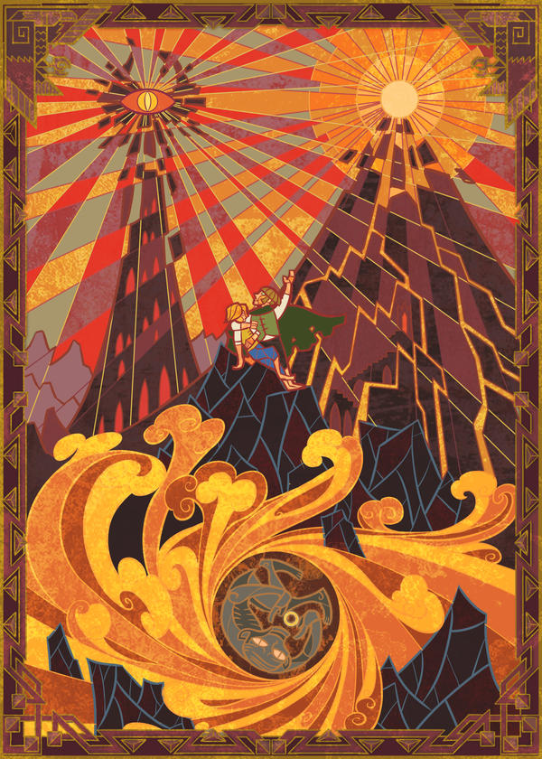
I agree on the cartoonish aspect of the stained glass, and whilst it's not my preferred style it has a place and I admire the talent., and it probably works better for TH, as I pointed out.... but I did also say my favourite was was this series of designs for LotR covers, which is less garish and less obviously cartoon-like... (clickable thumbnail)
Elen wrote:I really adore his(?) designs for the LotR covers, and I kinda think Tolkien would approve also!
There is magic in long-distance friendships. They let you relate to other human beings in a way that goes beyond being physically together and is often more profound.
~Diana Cortes
So I am the only one who thinks these don't look cartoonish. More than anything these designs and styles remind me of the Middle-ages frescoes present in various chapels.
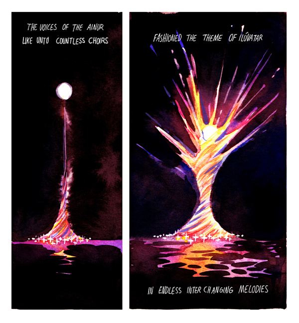
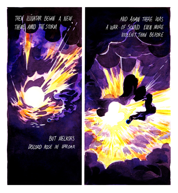
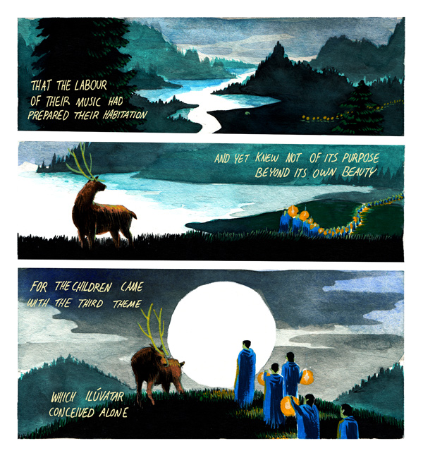
I especially like the Silmarillion artwork (which imo negates the claim that they are derivative of the PJ-films in this particular case)
I think it's the figures that are the most overtly "cartoon-like" in style... To me, the landscape elements have a certain stylized Art Deco appeal, and overall the look is reminiscent of an illuminated manuscript brought up-to-date!
There is magic in long-distance friendships. They let you relate to other human beings in a way that goes beyond being physically together and is often more profound.
~Diana Cortes
There is magic in long-distance friendships. They let you relate to other human beings in a way that goes beyond being physically together and is often more profound.
~Diana Cortes
There is magic in long-distance friendships. They let you relate to other human beings in a way that goes beyond being physically together and is often more profound.
~Diana Cortes
I don't know about better (I don't really understand the need to rank different artists), but they are very, very nice.
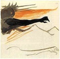
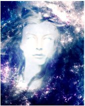
"Spirits in the shape of hawks and eagles flew ever to and from his halls; and their eyes could see to the depths of the seas, and pierce the hidden caverns beneath the world."
There is magic in long-distance friendships. They let you relate to other human beings in a way that goes beyond being physically together and is often more profound.
~Diana Cortes